Monday, January 31, 2011


This photo is from a spread from Another magazine in s/s 2006. This has all of Shores compositional elements but just with a real model which made me very happy. What I like about this is the equal and tight feeling this composition has. Your eye travels to her face then stops at the paint and back down and around to the bushes then upwards. The space between her feet and her head and the paint makes this feel organized. The 2 triangles also break up the horizontal lines. Even if she wasn't in it, It would be just as strong. Another beautiful element is this muted color which his photos have. It works really well for these photos. 


What caught my attention first about this photo was the depth of field. They aren't even that far away from the hose and its blurred!! It gave me instant chills. This flat consistent lighting is my favorite and works really well with the cold, cloudy morning feeling of this photo. I really love the round shape the hose is making with the yellow lights inside the house. The shapes take your eyes across the photo. Also the gloves create even more of a strong diagonal. There is so much good about this photo the last thing I realized was that they were matching.


What I don't care for about this photo is the angle. Maybe its the only way he could fit his 8x10 in the bathroom but it's personally his least appealing. I love his photos that are straight on and forward so I think that some of the work he has done at this high angle is not the strongest

Tuesday, January 25, 2011

2nd reading assignment

Joel Meyerwitz

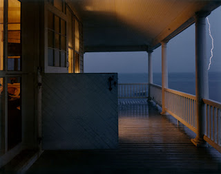
In one of my favorites by Meyerwitz, I dont think this composition could be any more dead on. His sense for lighting gives the feeling you are standing with him listening to the rain and thunder.  It's evident in his other photography, that he has been influenced by Eggleston and his color. Passing from left to right over the photo you really get the feeling of the cold of outside and warmth of inside, and that open window that brings the inside out. 

Todd Hido

For such a simple subject matter I find this photo extremely beautiful. Street signs are so everyday and common but here, Hido photographed them in a way never I dont think is often looked at. This wouldn't be half as strong without the orange signs but that small amount of color makes this something so different then what it would have been if they were not there. 

Doug Dubois

The reason I felt this was a great example is because Szarkowski mentions how in Egglestons work, he frequently shows us pictures of aunts and uncles, street signs where his photography could be more like a diary and that Is definitely how I felt about this series of family photos from 1984- 1992. These photos are true and would be just as beautiful if they weren't in color though he paid close attention to colors. The color contrast between the red and green are perfect with his red shoes. This definitely has the feeling of a snapshot, but is so much more closely looked at. Color was noticed here but maybe the subject matter first. 


Wednesday, January 12, 2011

William Eggleston

WILLIAM EGGLESTON


1. The subject is of an old woman smoking a cigarette sitting on an old couch
2. This particular photo looks ok in black and white. I prefer it in color, because there are so many beautiful and vibrant colors, why hide them?
3. What I like about the colors in this photo is that all of the colors compliment each other perfectly. If this was black and white then this would not be evident. Also the lines of the trellis in the background mimic the lines the couch make and the metal springs under the cushion.
4. Like I stated in 3, he uses compliments so well here that it's creepy (in a good way). 


1. Egglestons wife Rosa sleeping 
2. I enjoy this photo in black and white because there is a lot of tonal range. I prefer it black and white maybe as much as color
3.I dont know if I can say I dislike anything about this image. I chose it because I really really liked the composition and the situation. It seems so innocent and peaceful, even though the tv is fuzzy. I feel like I have a whole back story to this one. If I had to pick something it would be the white sheet/pillow in the bottom left corner. If a little was cropped from the bottem it would have only made it better. 
4. I think this situation spoke to him for a few reasons. He could have chosen any angle to take this but including the red light in the closet was such a great choice. It gives this eery quality because why the heck is the light red? 


1 little boy standing outside before sunset
2 This photo is ok black and white because it also has a nice tonal range. But better in color.
3 I was drawn first to the strong lighting. Then to the juxtaposition of the dark and stormy looking sky. And this child's face and stance looks so uncomfortable you cant help help but want to make him feel safe. If anything i wish he would have placed the boy a few feet further up past the road to take out the reflector because I think its detracts from the image. 
4. The red against the green and the dull blue sky give a dark feeling overall to the photograph.

Mike Bailey Gates

Mike is a an 18 year old photographer from New England who has been photographing since he was 13. He has an amazing resume already. Besides being featured in tons of magazines and Urban Outfitters blog, he has an art gallery showing at jesse smith and an exhibition in Brussels and France. His photography is very planned out and extravagant. He creates sets and scenarios that set him apart.
His choice of color and desaturation make a dreamy and light feeling.


Osamu Yokonami is a photographer based in Japan who does mostly advertising work. The work I chose that I really like from him is not his advertising but his series stuff. I have no idea what they mean or represent because well his website is in japanese which makes it a little difficult to read. What attracted me to his photographs was the lighting and color. All of his images seem too have a tint of blue, and I dont know how to explain but I like it. The photos are all also muted. It's the lighting and the non-saturation of colors that I would use for my own photos.  He is direct when he shoots and where he crops is always for the best.


Brooke Shaden

Brooke Shaden is 23 years old from Pennsylvania. She attended Temple university and graduated with film and english degrees. She now is a fine arts photographer based in Los Angeles. Her inspirations come from fairy-tales and old painting and such things. Her photos make me feel like she cares deeply about everyone of them. She has her techniques down and her own personal style. When I see something of hers, you can automatically tell its her work. She teaches a workshop on her techniques and editing in Los Angeles. The color palette she uses is always matted and her compositions are so simple but beautiful. Brooke is a great example of a photographer that successfully uses herself as a model which I respect very much.